Brand system · Vol. I
Rare bottles, wrapped in one green.
La Botillería · Premium Bodega · Galerija, Beograd
I. The name
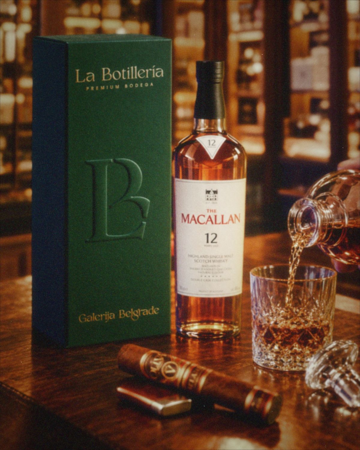
The bottle shop, dressed for the evening.
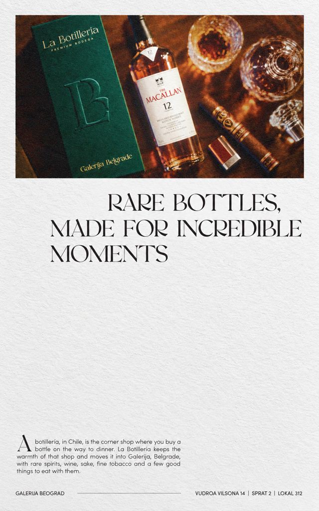
A botillería, in Chile, is the corner shop where you buy a bottle on the way to dinner. La Botillería keeps the warmth of that shop and moves it into Galerija, Belgrade, with rare spirits, wine, sake, fine tobacco and a few good things to eat with them.
The idea
Everything here is about restraint and light. One serif wordmark, warm against black. A green you'd find in a bottle held up to a lamp. Small measures of whiskey brown. The shelves are full, so the brand doesn't have to be.
How to use this book
Click, drag and type: almost everything on this page works. Colors copy their codes, the shelf talker fills in as you write, and the tokens at the end carry the system into code.
The mark
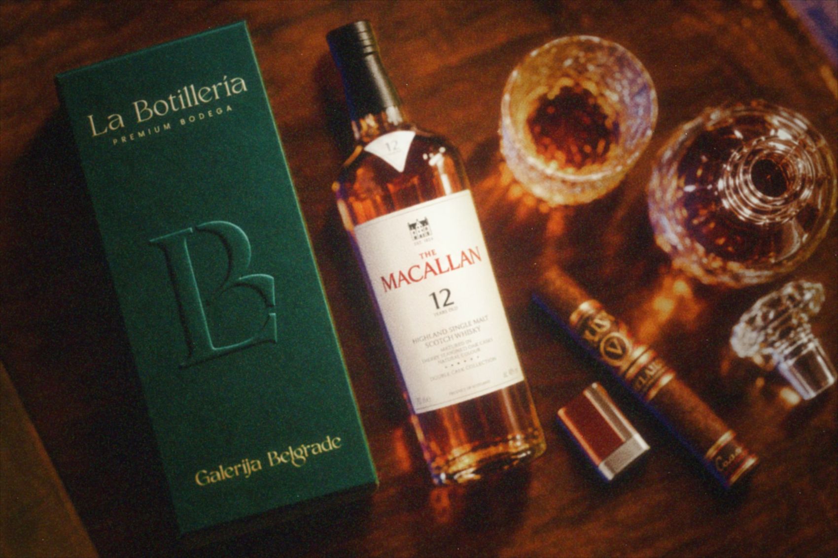
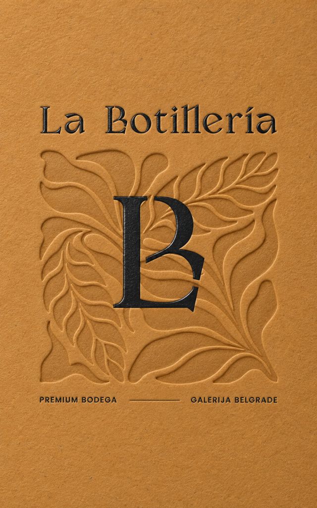
A high-contrast serif wordmark with "Premium Bodega" set wide underneath, the way a vintage sits under a name. The monogram folds the L into the B, for anything small enough to need a signature: a seal, a cork, a box lid.
Clear space
Half the height of the capital B, on every side. The monogram keeps a margin of a quarter of its own width. Stacked, the monogram sits one cap height of the name above it.
Smallest sizes
Wordmark with descriptor: 35 mm or 160 px wide. Below that, drop "Premium Bodega". Monogram: 8 mm or 24 px tall.
Which version
The wordmark signs the shop, the bag and the website. The monogram signs everything you hold: seals, tags, boxes, the avatar.
Color
Four colors taken off the shelves, and one tint for the dark. Sake is the page, Emerald is the signature, Smoke is the structure, and Whiskey is poured in small measures. Click a color to copy its code.
Emerald and Smoke are neighbors, never partners. They're almost the same darkness (1.15:1), so one is never text on the other. Put Sake or Dram on top of either.
Whiskey lives on Sake. It reads at 5.6:1 on ivory and disappears on the darks. On Emerald and Smoke, use Dram instead.
Sake is the default page. White is never used; on screen and on paper, the light is always ivory.
One gold. Dram on screen, warm gold foil in print. No gradients, glows or metallic inks beyond that.
Type
Two voices. Valky speaks: names, headlines, prices, anything that should feel like a label on an old bottle. Poppins SemiBold labels: wide, small capitals that do the filing. Poppins Regular carries running text, because Valky is a display face.
ABCDEFGHIJKLMNOPQRSTUVWXYZ abcdefghijklmnopqrstuvwxyz 0123456789 & ? ! ¿ ¡ ( ) « » ‘ ’ “ ” · • … £ $ € š ž Š Ž ñ í é á
Whisky · Scotland · 18 years
Highland Single Malt
Honey and orange peel on the nose, a little smoke from the cask, and a long, dry finish. Best neat, or with one drop of water. Click any line and type to try your own.
Valky has no č, ć, đ and no long dashes. Those characters fall back to Cormorant Garamond here, which is close but not the same. Worth asking the foundry for them, or drawing them, before any Serbian headline goes to print.
Finishes & pattern
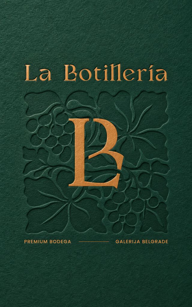
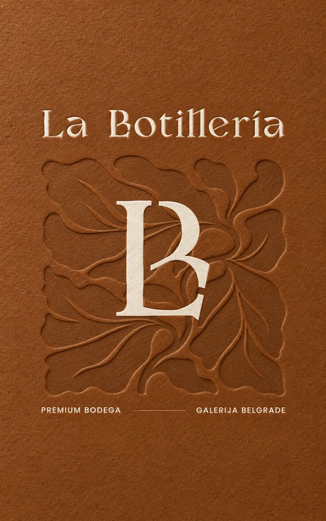
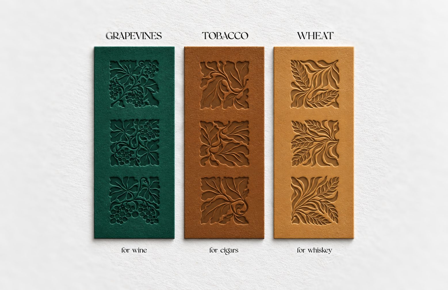
The identity is meant to be touched. Three finishes carry the name and the monogram, and one pattern dresses the paper. Gold is always flat: Dram on screen, hot foil in print.
The gift cards
Three fronts, one per mood, and a back left mostly empty for the note.
The monogram pattern
For tissue paper, box linings and gift wrap. Choose a paper, an ink and a rhythm; copy the SVG for the printer.
The shelf
New in this system: the paper that lives on the shelves. Fill in the form and the shelf talker and price tag set themselves, in the house style. Sample bottles, sample prices.
On screen
Also new: the parts a La Botillería website is built from, working right here. An age gate, header, a cover, filters, product cards, a bag that counts, the newsletter and the visit block. Sample products and prices.
Are you 18 or older?
We sell wine, spirits and tobacco, so we have to ask.
Rare bottles, kept well.
Single malts, grower Champagne, sake from small breweries and cigars that were worth the wait.
In the cellar
Buttons: primary, secondary, outline, link, disabledThe cellar letter
New arrivals and tastings, once a month. Nothing else.
Visit
- Where
- Galerija, Vudroa Vilsona 14, 2nd floor, unit 312, Beograd
- When
- Every day, 10:00 to 22:00 (sample hours)
- Tastings
- Thursdays at 19:00, by booking
In store
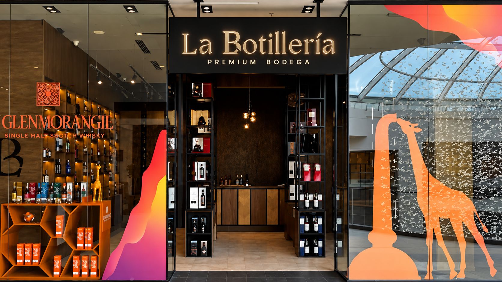
The sign in Galerija: the wordmark lit warm against black, the one moment the identity is allowed to glow.
Tokens
Everything above as CSS variables, ready for the website.
Load Valky from your own files with @font-face, and Poppins 400 and 600 from Google Fonts. Cormorant Garamond covers the characters Valky doesn't have.
/* La Botillería · design tokens */
:root {
  /* color */
  --lb-emerald: #123A32;  /* Emerald Velour, the signature */
  --lb-smoke:   #2B2A28;  /* structure, type on light */
  --lb-sake:    #F3EEE2;  /* the page */
  --lb-whiskey: #8B4F24;  /* accents on Sake only (5.6:1) */
  --lb-dram:    #CB9150;  /* accents on Emerald or Smoke; gold foil in print */
  --lb-paper:   #EAE3D4;  /* panels on Sake */
  --lb-muted:   #625D55;  /* secondary text on Sake */

  /* type */
  --lb-display: 'Valky', 'Cormorant Garamond', Georgia, serif;
  --lb-sans:    'Poppins', 'Helvetica Neue', Arial, sans-serif;
  --lb-d1:    400 88px/1 var(--lb-display);
  --lb-h1:    400 56px/1.05 var(--lb-display);
  --lb-h2:    400 36px/1.1 var(--lb-display);
  --lb-h3:    400 26px/1.15 var(--lb-display);
  --lb-label: 600 12px/1.3 var(--lb-sans);  /* uppercase, letter-spacing .26em */
  --lb-p1:    400 17px/1.65 var(--lb-sans);
  --lb-p2:    400 14px/1.6 var(--lb-sans);

  /* shape */
  --lb-radius: 0;          /* square corners everywhere */
  --lb-rule:   1px solid rgba(43,42,40,.16);
  --lb-button: 600 10.5px/1 var(--lb-sans);  /* uppercase, .22em */
}